“[This is] me working on final art here. Surrounded by all things hello! hello! …studies, finished finals, bamboo pens, snacks.”
(Click to enlarge)
In a November 1 feature for the Kirkus Book Blog Network, I chatted briefly with author/illustrator Matthew Cordell, pictured above, about his latest picture book, hello! hello!(Hyperion, October 2012). I’ve got the interview in its entirety today, and Matt’s also here to share some early jacket covers, studies, early illustrations, and a bit of final art.

If you read 7-Imp at all or even occasionally just visit, you know that I fell hard for this book this past summer, when I was lucky enough to see an early copy. I still love it fiercely. What I wrote at Kirkus last week is this:
This is picture book-making at its best. Using masterful pacing, economical yet robust lines, and a satisfying explosion of color, Cordell tells a story that could be the story of most 21st-century American families, frequently plugged into the online world no matter their socioeconomic stratum. A young girl, trying to connect with family members more connected to their hand-held, electronic devices, heads outside and gets rapturously lost in nature and the world of her imagination. Cordell pulls it off with delicacy, a sophisticated restraint and a satisfying elegance. Oh, and humor to boot.
By all means, if you haven’t seen a copy yet, I highly recommend it. (And if you really do want to read it, I should add, you can even get free art from Matt right now. You can head over to this post at his blog to find out more. Signed bookplates! Signed postcards! Signed proofs! And signed prints! Can’t get much better than that.)
Here’s the full interview with Matt, along with lots of images. I thank him for visiting 7-Imp again …
Jules: At heart, this is a so-called “message book,” as many picture books are, though I think you do it so beautifully and not at all in a heavy-handed way. You’ve mentioned this at your blog, but can you talk here about why you wanted to do a book about this? Also, what specific choices did you make to keep it from being too much of a lesson for readers?
Matthew: As a new-ish parent (my daughter’s nearly four now), I am always finding myself in new situations and experiences at completely unexpected moments. In this case, what happened was my daughter Romy, who was about two years old at the time, and I were playing with some of her toys in our family room. At arm’s reach was the beckoning glow of a laptop computer. I thought surely she would not know the difference if I stopped playing and went over to check my email (or worse, my Facebook page—ugh). So, I did. And it was going well enough at first, until I heard her little voice squeak from across the room, “Dada, stop checking email and play.”
I was shocked. Partly because I had no idea she knew the word “email.” But also because I was totally busted by my kid, whom I thought wouldn’t comprehend what I was doing and that I wasn’t there for her. I felt neglectful, selfish, and guilty. Later, it occurred to me that I could not be the only 21st century parent who would have done this exact same thing and felt this exact same way.
So, I started watching. At parks, shopping malls, ball games, libraries. There is always a parent attending to his/her phone while in the presence of a child. An often bored-looking child. This is not to say that these are bad parents. They are, after all, with their families at parks, malls, games, libraries. But I think we lose sight of how easily and often we get distracted we these days. (Everything you need is right there on your phone!) And by giving the phone, computer, or tablet too much time, it diminishes our own attention spans and sends the wrong message to our little ones.
Right away, I knew that the picture book was the perfect platform to tell this story. Parents and young children read picture books together. And in these moments of shared reading, they are not on the phone, computer, tablet (thankfully not so much yet, anyways), and it is a perfect, quiet moment for this story to be heard and teased out by moms and dads and kids alike. (Kids can be pretty screen-reliant themselves, right?)
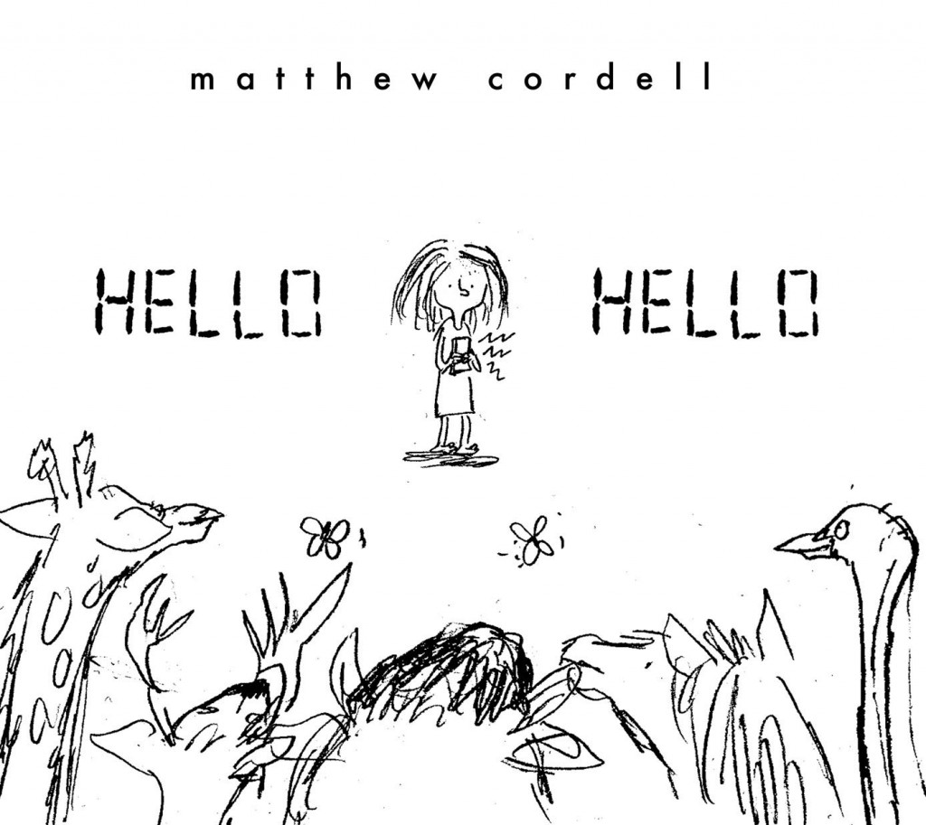
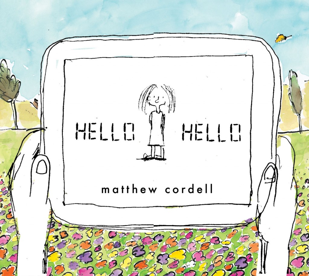
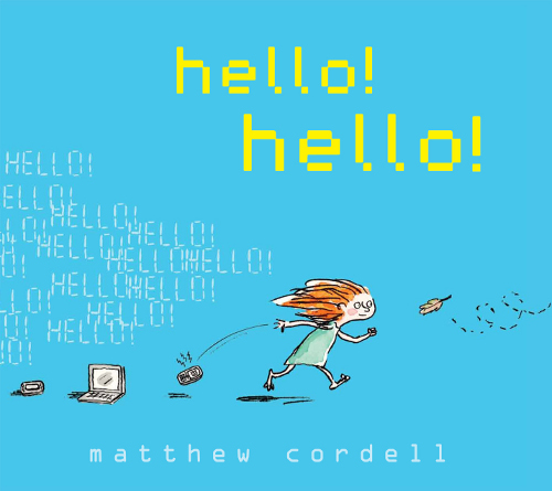
Matt: “Shown here are just a few of the many discarded jacket ideas. We went through a ton of sketches just to get it right. Ultimately, my wonderful art director, Joann Hill, had the great idea to use, as our final jacket, an abandoned sketch I’d shown previously for possible front endsheets.”
(Click each image to enlarge)
I was very conscious of not wanting the book to be finger-pointy. Not only can an overly didactic picture book get corny and fail fast, it is not an effective way to make one’s case. I felt that the negative side of the story should be at the beginning and brief–where the child is bored of her gadgets and is lonely. She looks to connect with her family but is brushed away by her mom, dad, and brother in favor of their own gadgets. I needed to tell that but not dwell in that moment. But instead dwell in the lovely things that would come from turning off the machines and seeking out forgotten alternatives, specifically nature and imagination. And followed this by illustrating how to take this re-connection and share it with our loved ones in order to bring the family closer together.
It also helped that there is very little text in hello! hello! The text of a message-y book could make or break it, if not handled with finesse. Fortunately, in this case, because no one is talking to each other, I emphasized the point by telling the story with essentially just one one word: hello.
Jules: I can’t remember if you’ve talked about this elsewhere, such as your blog, but did you, by chance, have various endings for this book? Or did you always know where the story would take readers?
Matthew: The funny thing about this story is it all came out of me so fast and so easy. The story formed in my head completely, beginning to end, so I roughed it out quickly before it had a chance to evaporate. Incidentally, this never happens to me. Writing a well-rounded picture book story has been pretty difficult for me up to this point. Of course, after it was picked up by Disney-Hyperion, there were many little tweaks here and there, but the basic narrative structure never really changed. There was one significant change, though, that my most excellent editor, Kevin Lewis, brought to the table that blew my mind. This was something that wasn’t in the original manuscript.

(Click to enlarge)
My original idea was that, once Lydia gets outside and starts inviting nature back into her life (leaves, rocks, bugs, flowers), this would be a building sequence partly culminating with her befriending and riding atop a wild horse. After this, a stampede would build, which it does in the finished book, but my original idea was it would be a rollicking stampede of all and only horses.

Early study (click to enlarge)

Final spread (click to enlarge)
Kevin pushed me to take it to a much greater place. He said that if the imagination was at work here, then really let the imagination do some work. That’s when I completely cut loose and brought in the stampede with dinosaurs and flying fish and flying whale, giraffe, lion, buffalo, etc. This is an incredibly important moment in the book, so I really must doff my cap to the wonderful collaborative genius of Mr. Lewis here.
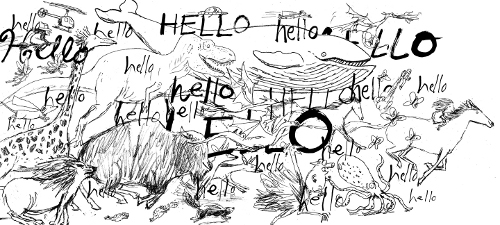
Matt: “Initially, for that explosive stampede spread, I had planned on making it complete chaos, including elements of weirdness and fantasy. My editor talked me down a bit and had the good idea to keep it ‘real’ with animals that exist (or existed), but still playing up the fantasy by keeping the flying fish, whale, etc.”

Another abandoned interior spread
(Click to enlarge)
Jules: I love the different cover illustration under the jacket and how the protagonist’s gesturing matches up with the one on the jacket. Whose idea was it to have a separate illustration for the jacket cover?
Matthew: Speaking of collaboration, this was a really special moment had while putting the jacket together.
I was on a conference call with Kevin and our excellent art director, Joann Hill, and I had brought up the idea of doing a separate image on the case cover than what would be on the jacket. (I’d just done this for another picture book of mine, Another Brother.) I don’t remember who suggested what, but this whole brainstorm happened quickly and very organically.

(Click to enlarge)

(Click to enlarge)
Someone suggested the jacket and case could be the same image, but slightly different. Then someone suggested Lydia could be the exact same and in the exact same position, but in two different places from the story. We knew the jacket would be the technological end of things, because that’s the central theme, so someone said she could be running through that field of flowers. Then someone said we could die-cut the jacket in the shape of Lydia so that she showed through on the case (it would have to really line up). And that’s where we pumped the brakes and backed off a bit.
It really was a lovely, goosebumpley creative moment.
Matt’s Studies for hello! hello!
Matthew: Some of these are early drawing and character studies using the bamboo pen.
Some of these other images … My original idea was to use two completely different styles of art for the book. The front art was to be more reflective of a technological theme–depicting the characters as computer-rendered or something like that. We went through tons of ideas to try and work this out. (I’m sparing you by showing only a handful here.)
In the end, we agreed that to do something so drastically different was looking too forced. We decided to create a more subtle transition from a disconnected indoor family to a brought-back-together, outdoor one. As seen in the book, the transition goes like this:
1. Family is in black and white with very sparse backgrounds (lots of white space). Lydia is the only one in color since she’s already “broken the spell” of the gadgets.
2. When Lydia first starts experiencing (re-experiencing, really) elements of outdoors and nature, it’s introduced slowly. The bits of nature (a tree, a large stone, the beginning of a field of flowers) are still presented with stark white-spacey backgrounds, tapering up, with each page turn, to full-blown color, full-bleed spreads when she is completely engulfed by nature and imagination.
3. When Lydia’s cell phone rings, the imagination and bliss comes to an abrupt halt. White space backgrounds show up again.
4. When Lydia returns home, where it’s still black and white, the transition repeats.


(Click to enlarge)

(Click to enlarge)

(Click to enlarge)

(Click to enlarge)

Study in watercolor
(Click to enlarge)

Early study: Crosshatching)
(Click to enlarge)

Early study: Robot characters
(Click to enlarge)
Jules: You’ve had a handful of book releases this year. What’s next for you?

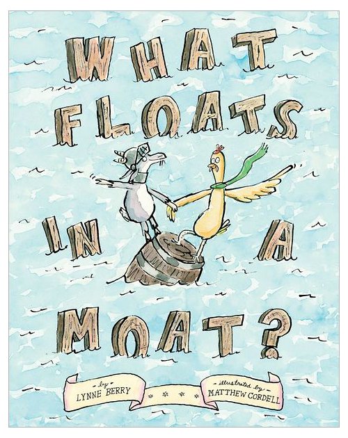
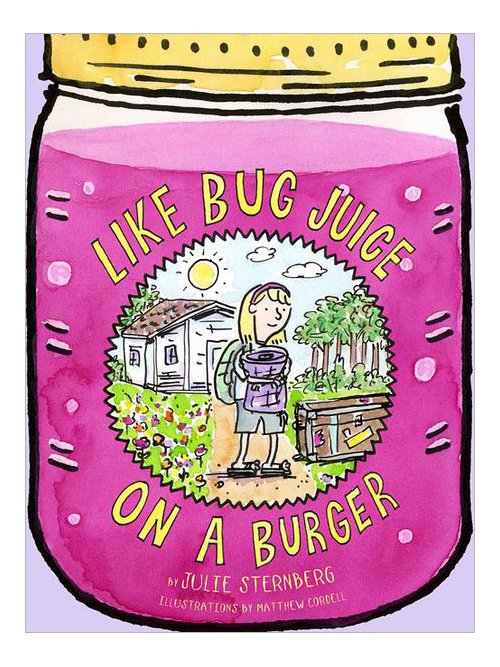
Matthew: At the moment, I have four books planned for release in 2013: Ollie and Claire, a picture book by Tiffany Strelitz Haber; What Floats in a Moat, a picture book by Lynne Berry; Like Bug Juice on a Burger, a middle grade novel by Julie Sternberg (a sequel to Like Pickle Juice on a Cookie); and Gone Fishing, a novel told in many forms of verse by Tamera Will Wissinger.
I’m super psyched to say I’ll soon be illustrating a picture book written by the amazingly multifaceted Philip C. Stead at the hands of picture book guru Neal Porter.
And I’m working out the kinks on two stories of my own, with real hopes to find homes for these soon.
But perhaps above all else, I’m always looking for that time to, you know, stop checking email and come play.
Thanks again to Matt for visiting. If you’re interested in seeing the trailer for hello! hello!, it’s below. The music was composed and performed by author/illustrator Philip C. Stead.
HELLO! HELLO! Copyright © 2012 by Matthew Cordell. Published by Disney/Hyperion, New York. All images here used with permission of Matthew Cordell.
 This and many more of Jules’s adventures in books, kids’ lit and illustration can be found at her acclaimed blog, Seven Impossible Things Before Breakfast, where the blog about Komako Sakai was published on May 12, 2013 and the blog about Elisabeth Craster appeared on May 5, 2013. Visit often. It’ll do your body and soul good.

